 On Saturday I demonstrated some projects I had made with Tim Holtz Crackle Paints. I really enjoy using any of Tim Holtz's Distress products but found the crackle paints to be
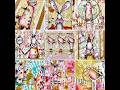
 really inspiring and I got some ideas for techniques from the Ranger web sight. I really love the resist crackle technique that I have done in the tags above, it looks so effective but is so easy to do. The photo frame in the bottom left was one I had done a while ago by just putting a coat of crackle paint on a papier mache frame and then distressing it with
  vintage photo distress ink. It has a photo of my daughter in it and she just had to have some fairy wings!
And the last frame I got inspiration from an article in the latest Craft Stamper magazine. I saw the article and just had to make my own version of it. Rock candy crackle paint with shimmer inks sprayed on it and embellished with prima flowers and idea-ology metalwork. In the frame is a collage of stampers annonmymous stamps using co-ordinating distress inks. I am very happy with the outcome.
 a collage of stampers annonmymous stamps using co-ordinating distress inks. I am very happy with the outcome.


.png)


No comments:
Post a Comment